
For-sale inventory vs 2017–19 by ZIP code
An interactive U.S. map of for-sale inventory vs 2017–19 for states, metro areas, counties and ZIP codes. Latest data: September 2026. PLUS
Open for-sale inventory vs 2017–19 on the map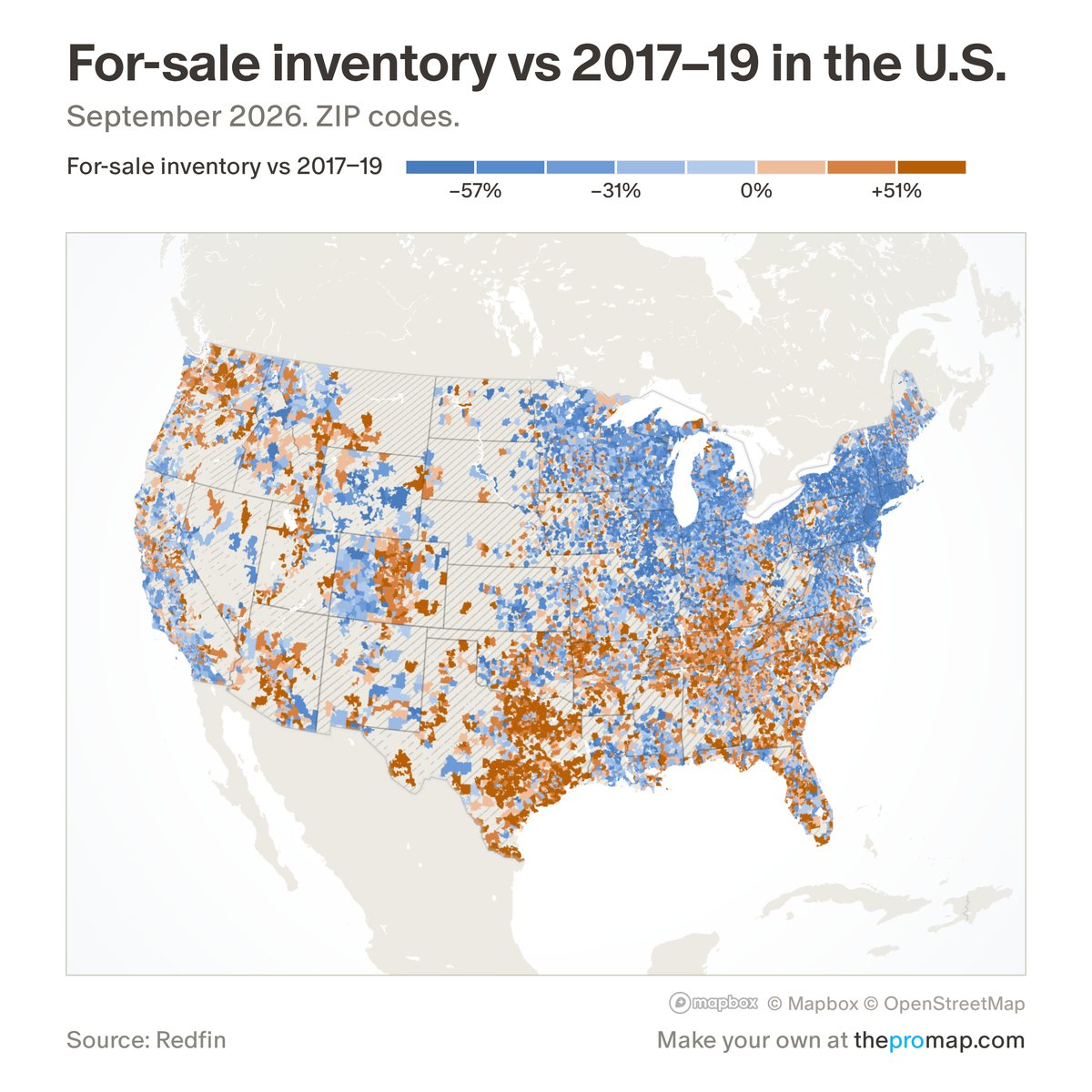
What this measure is
Homes for sale in the latest month against the average for the same month in 2017–2019, from Redfin. Positive means more homes for sale than before the pandemic. Areas are hatched where the base is under 5 homes or where Redfin's coverage changed sharply, since those jumps come from a local listings feed being added or lost rather than from the market.
Source, dates and coverage
- Source
- Redfin Data Center.
- Updated
- Monthly. Latest data on the map: September 2026.
- Areas on the map
- States, metro areas, counties and ZIP codes.
- Group
- Affordability & valuation
- Access
- ProMap Plus ($19 a month or $190 a year).
Values for every place
For-sale inventory vs 2017–19 is a ProMap Plus measure. The map shows it for the areas listed above. This page shows the map's national picture, the method and the source, and no figures.
ProMap Plus costs $19 a month or $190 a year. A free 7-day trial is offered on the map.
See for-sale inventory vs 2017–19 in ProMap PlusHow to cite
Please also credit the original source: Redfin Data Center.
More affordability & valuation measures
- Monthly cost to buy
- Cost to buy as % of income
- Income needed to buy
- Price-to-income ratio
- Price-to-income vs 2000–19
- Home value vs 2022 peak
- Fall in the 2007–12 crash
- Zillow forecast: next 12 months
- Price-to-rent ratio
- Gross rental yield
- Owning minus renting (monthly)
- Homes sold vs 2017–19
- Owners with a mortgage